-
PRODUCTS
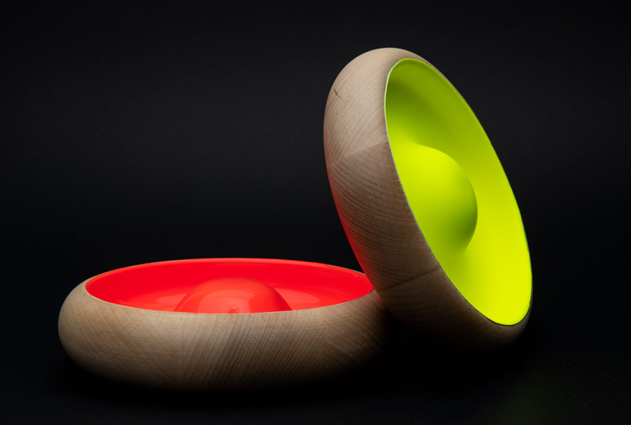
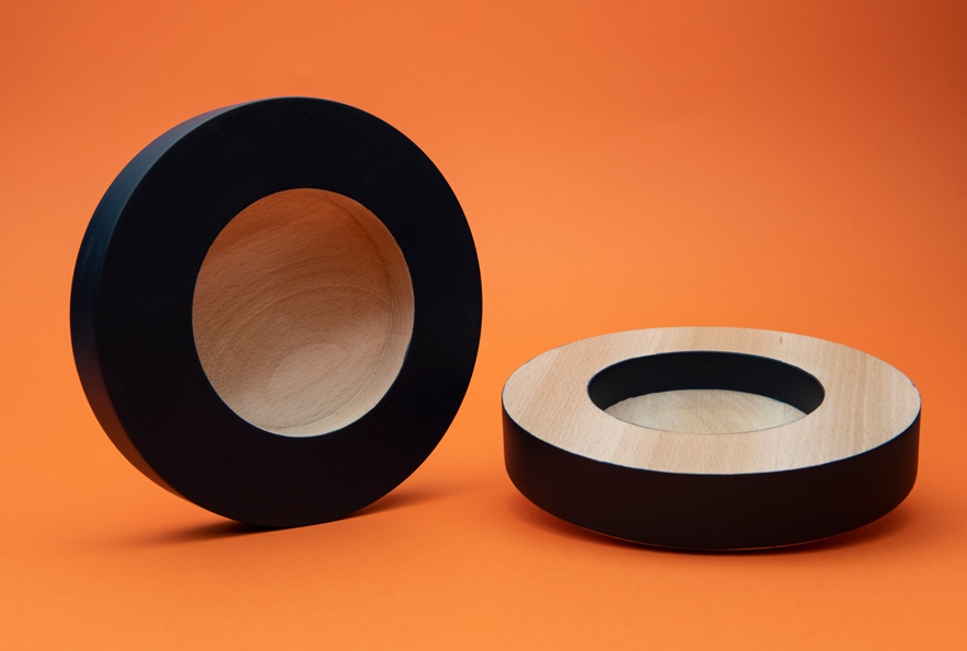
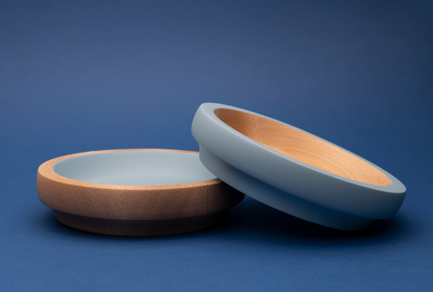
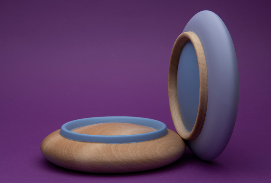
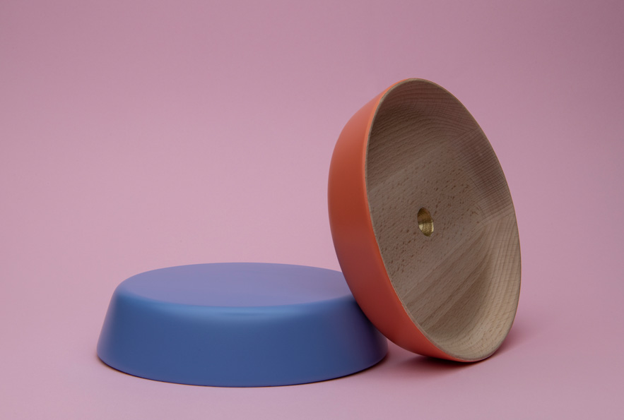
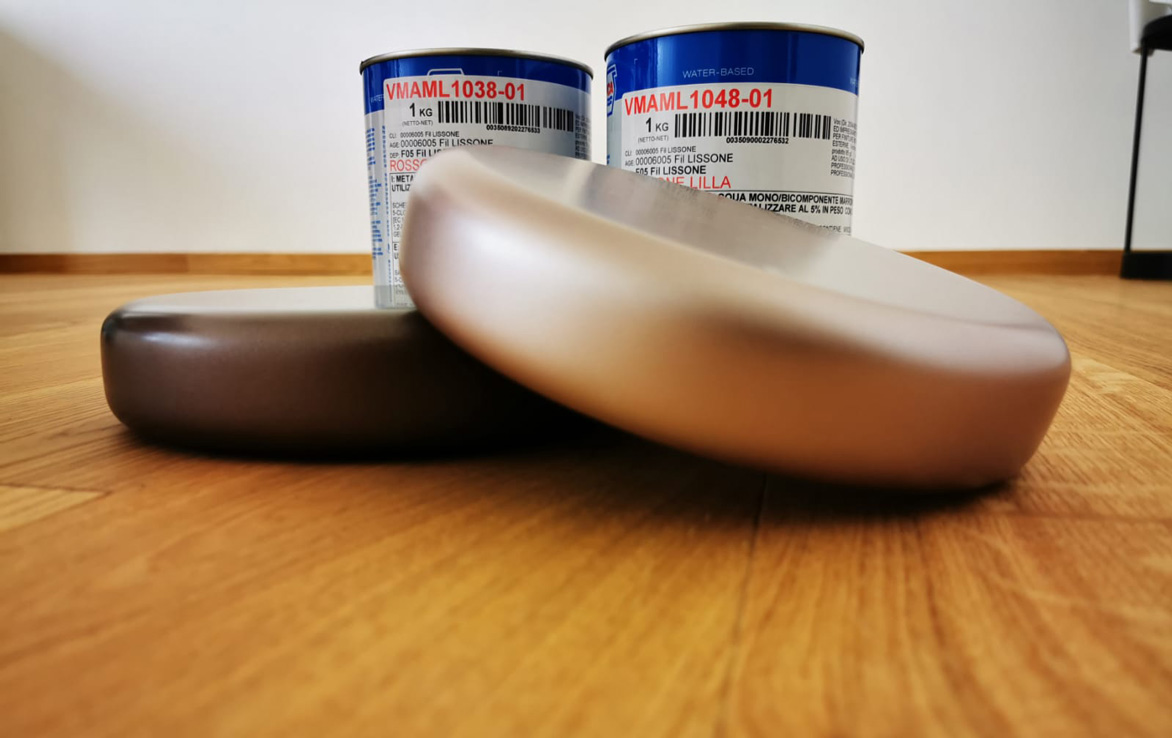
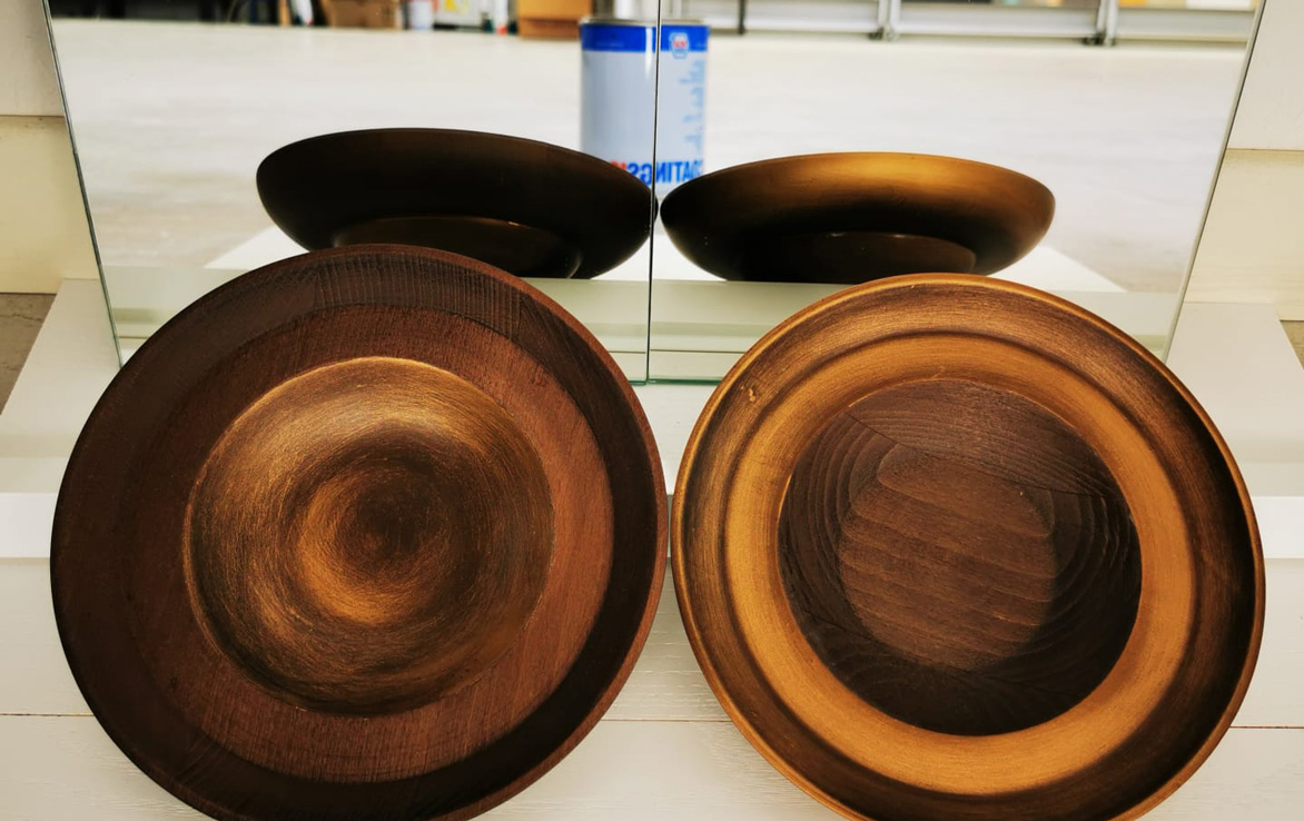
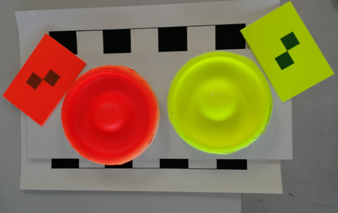
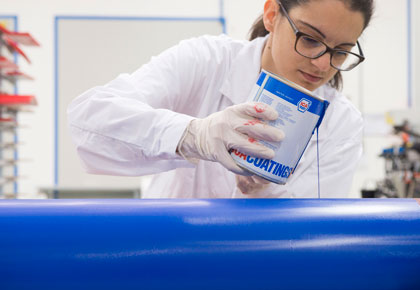 Our products are designed to protect and decorate wood and glass with a common denominator in mind: to combine innovation, high quality and low environmental impact.
-
SERVICES AND CONSULTING
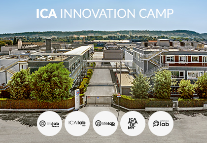
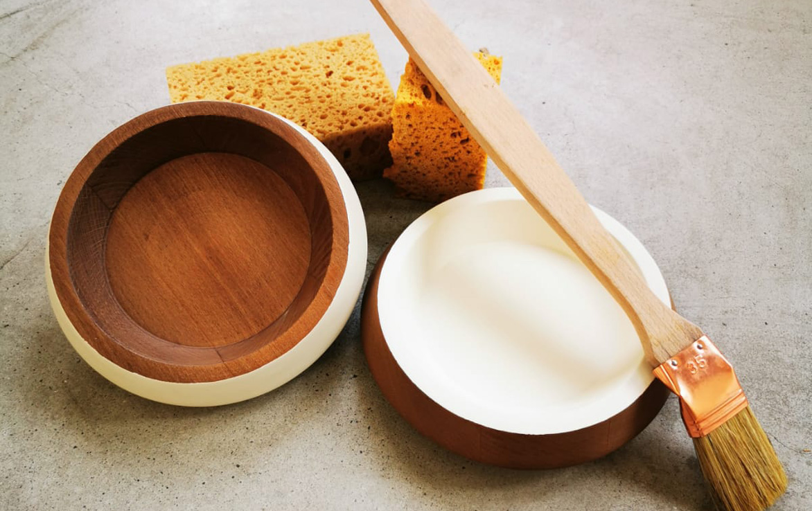
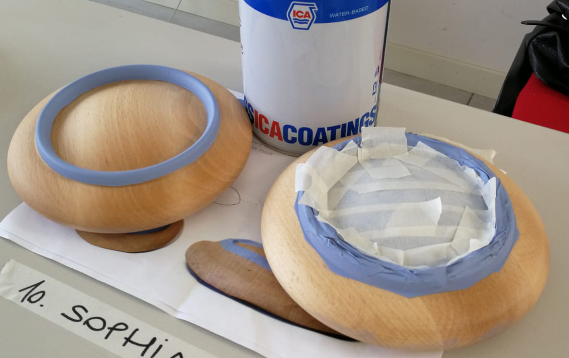
ICA INNOVATION CAMP is knowledge, relationships, and daily innovation. It is the perfect place to discover how a product is created, what drives a creative process, how a new coating is tested, and much more.
-
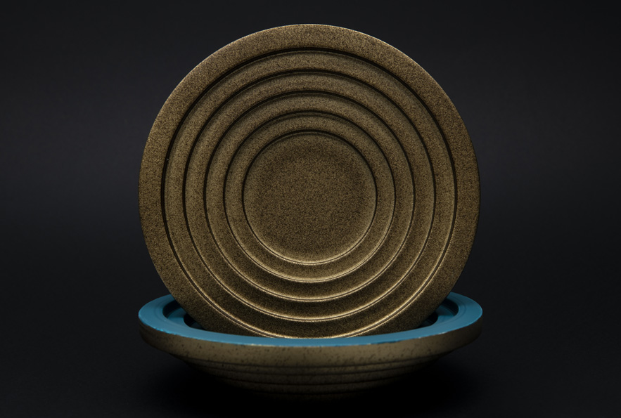
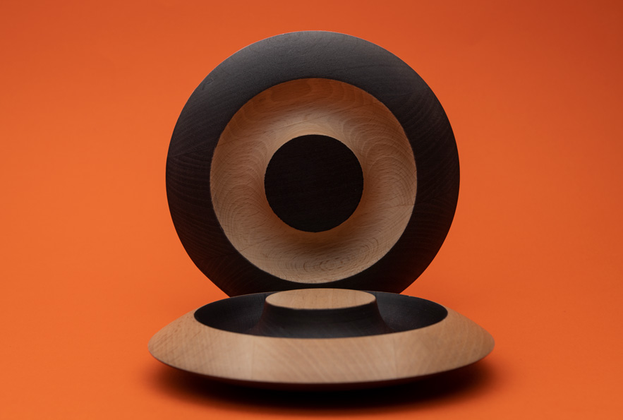
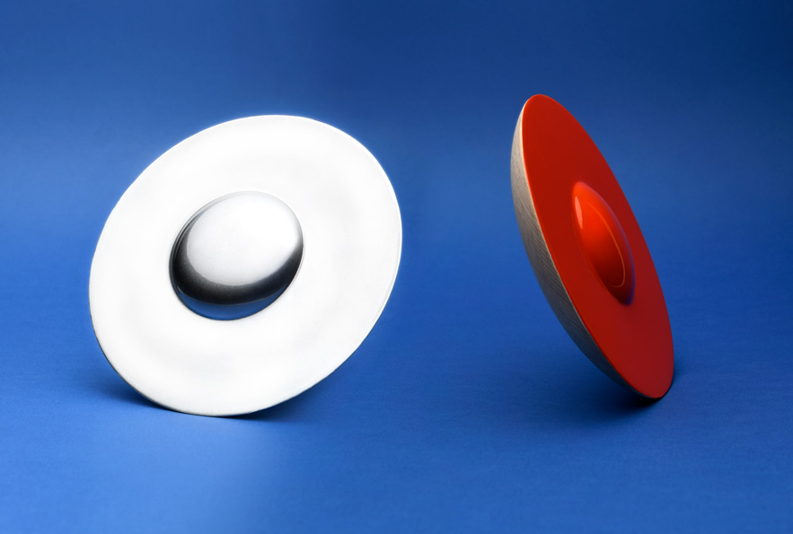
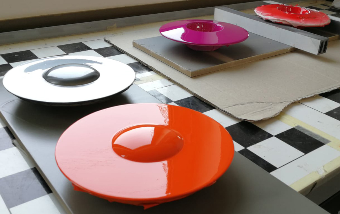
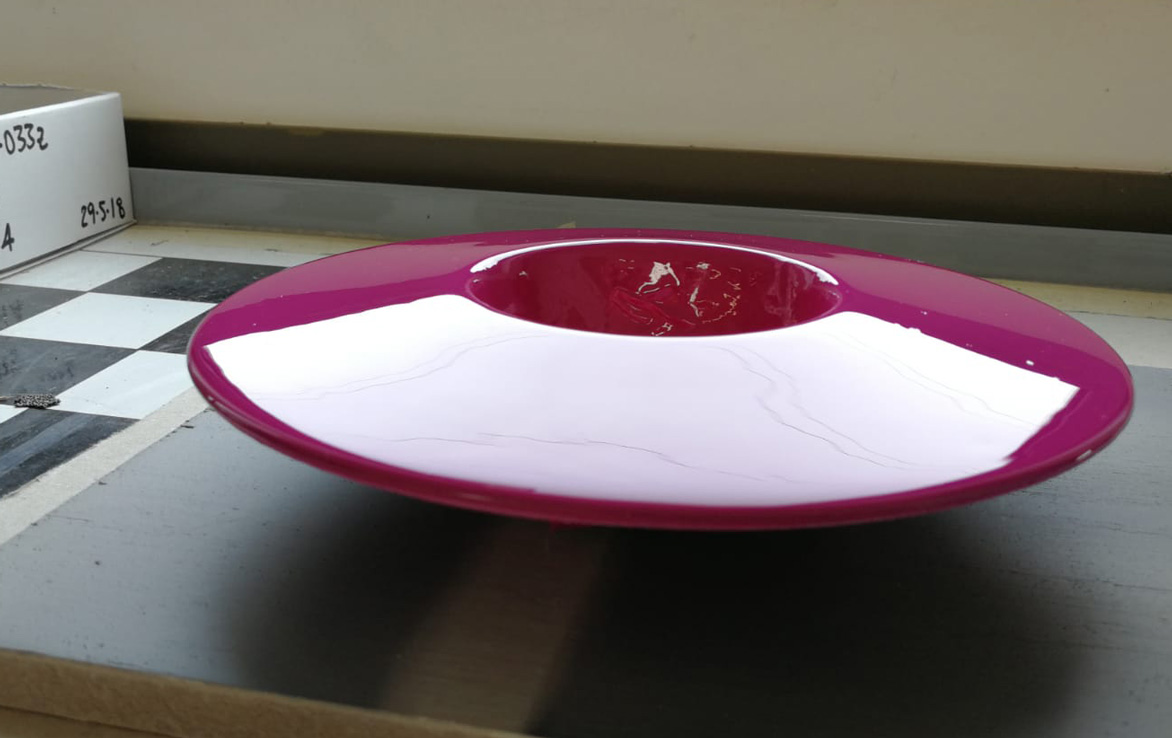
DESIGN & PLAN
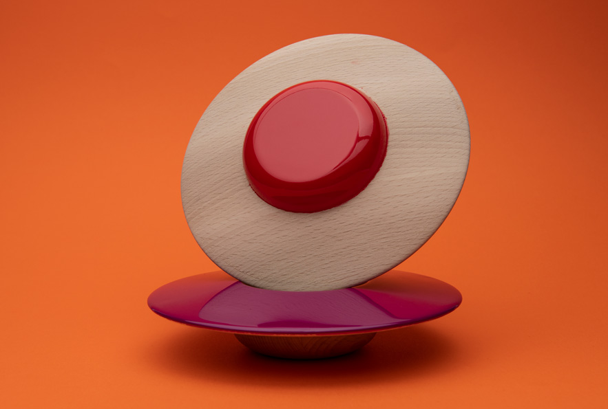
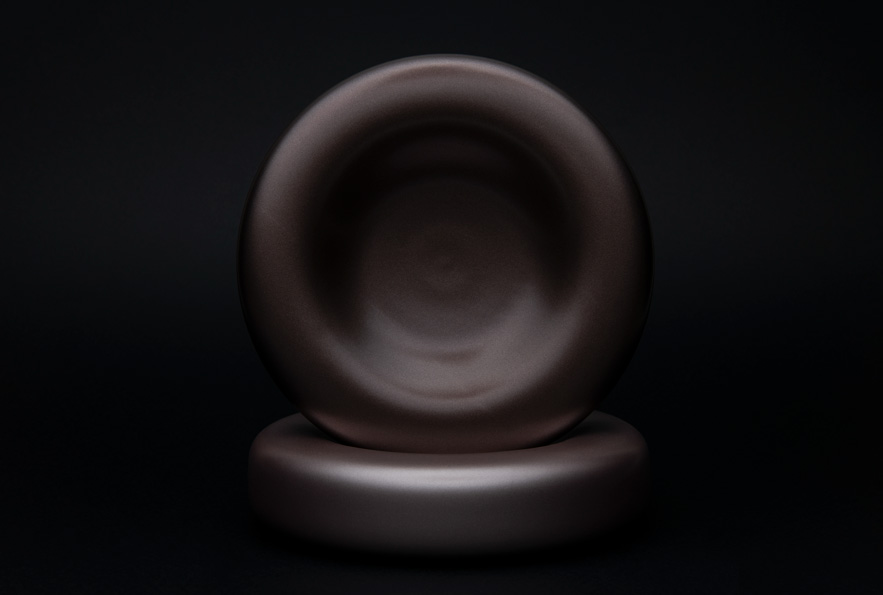
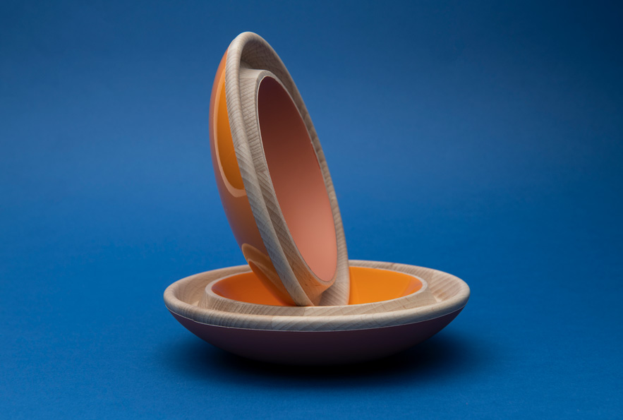
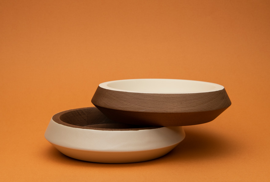
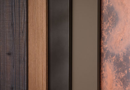 The ICA Group world is constantly evolving, always attentive to design trends and to the requests of designers and architects. Our color and finish trends are a source of inspiration for the Italian and international market every day.
- Case Study
- Sales Network
-
THE GROUP
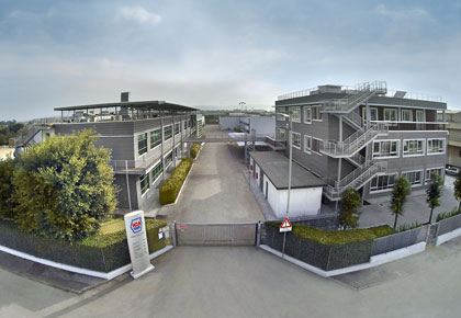 We are a big group with firm and deep roots. Thanks to our know-how, R&D investments, respect for the environment and high quality, we have become world leaders in innovative coatings for wood and glass.
- News